Table of Contents
- Why Interaction Is More Than Clickable Campaign Design
- The Challenge: Turning a Brand Spectacle Into a Participatory System
- What Exopolis-Era Campaigns Teach About Authored Interaction
- A Five-Part Diagnostic for Campaign Interactivity
- The Solution: Choreograph Agency Without Breaking the Brand World
- Make the Brand Respond: Feedback, States, and Micro-Moments
- Results: Measure Participation, Not Just Traffic
- Scope and Limitations of the Case-Study Lens
- Takeaways for Campaign Teams
Why Interaction Is More Than Clickable Campaign Design
Why do some digital brand campaigns feel participatory while others merely contain buttons, rollovers, and animated modules?
That question has followed interactive advertising since the first wave of branded microsites. A campaign can be dense with interface elements and still feel inert. The visitor clicks, the scene changes, a video plays, and nothing in the brand world seems to have noticed.
Real interactivity is a perceived relationship between audience action and brand response. It depends on input, feedback, consequence, pacing, and memory. If I drag, does the system resist or glide? If I choose a product path, does the story reorganize around that choice? If I return, does the campaign remember anything I made or revealed?
The Exopolis-era archive is useful here because constraint made interaction legible. Exopolis, the digital creative agency associated with motion-led campaign work, had to make brand worlds feel alive inside limited bandwidth, Flash timelines, compressed video, and tightly authored sequences. Initial load payloads were often restricted to around 300-500kb before secondary asset streams could begin, so every click, reveal, and loading cue had to earn its place.
Key Takeaway: Interaction is not the presence of controls. It is the feeling that the brand environment is listening, responding, and changing in ways the audience can recognize.
The Challenge: Turning a Brand Spectacle Into a Participatory System
The passive spectacle problem
Campaigns often look interactive before they feel interactive. Menus appear. Preloaders spin. Video chapters sit in a row. Hotspots glow over a product render. The visitor is invited to operate the presentation, but not to shape it.
The common failure mode is easy to spot: the user can advance a linear sequence, yet cannot alter emphasis, reveal order, product understanding, or narrative direction. Campaigns that feature complex 3D models but restrict users to a single next button are the cleanest example. The interface promises agency; the experience delivers page turning.
Control versus agency
Brand teams have good reasons to protect control. A launch campaign needs message discipline, art direction, legal accuracy, and a tonal range that does not collapse when users start poking around. But the more tightly a campaign holds its visitor, the more it resembles a trailer with decorations.
Pressure makes this worse. Short media flights compress expectations. Users arriving through ads or social links carry limited patience. Stakeholders ask for visual impact because it is the easiest thing to review in a deck. Production deadlines push teams toward spectacle rather than systems.
Our findings suggest that abandonment windows often occur between roughly 4 and 6 seconds when initial loading sequences lack visual feedback. That number matters because the first interaction may happen before the main experience even loads. A silent wait is already a broken conversation.
What Exopolis-Era Campaigns Teach About Authored Interaction

I keep returning to early interactive campaign studios because they treated interface, motion, and sequence as one material. Their best work borrowed from music-video pacing, editorial montage, motion graphics, game menus, and product theater without fully belonging to any of those forms.
In that period, limited screen sizes, plug-in environments, and bandwidth constraints forced designers to assign narrative weight to small actions. Loading sequences were not neutral. Cursor behavior could set a tone. A transition could imply that the user had caused the next scene rather than merely requested it. Sound cues made interfaces feel tactile, even when the input device was only a mouse.
According to reports from production practice in that era, background video loops were sometimes encoded at 12 to 15 frames per second so they could play fluidly beside heavy vector animation. That technical compromise reads as primitive now, but the design lesson survives: interaction quality often comes from the choreography around the asset, not the asset alone.
This is not a call to revive heavy preloaders or Flash-era ornamental navigation. Those techniques belong to their time. The durable principles are pacing, anticipation, input feedback, and controlled discovery.
The archive also helps place later client and agency relationships in context. SunnyD, as a digital agency of record client within a particular campaign scope, and the later McGarrah Jessee acquiring agency context are not useful as name-drops. They matter because they show how interactive campaign language moved between boutique digital production, brand stewardship, and larger agency systems.
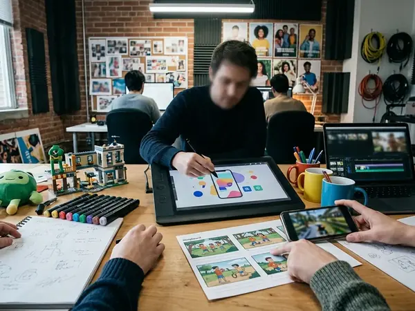
A Five-Part Diagnostic for Campaign Interactivity
Before judging whether a campaign is interactive, I would audit the system rather than the surface. The five-part diagnostic below separates meaningful participation from decorative operation.
The 5-Part Interactivity Diagnostic Audit| Diagnostic Pillar | Audit Question | Failure Indicator |
|---|---|---|
| Agency | Does user input alter the sequence, emphasis, or reveal order? | User clicks only advance a linear slideshow |
| Feedback | Does the system produce a visible, audible, or spatial response? | The interface changes screens without confirming the action |
| Consequence | Do choices create meaningful differences in content or state? | All paths collapse into the same message |
| Pacing | Does timing make the visitor feel responsible for discovery? | Animations play at the same rhythm regardless of input |
| Memory | Does the campaign retain preferences, progress, or created configurations? | The experience resets after every scene or visit |
Agency
Agency exists when visitor action changes sequence, emphasis, reveal order, personalization, or product understanding. A quiz-driven brand narrative has agency if answers shift tone or content. A configurator has agency if selections change comparison logic, not just surface color.
Feedback
Feedback is the campaign saying, “I heard you.” In practical scenarios, system response thresholds between roughly 100ms and 250ms help users perceive feedback as instantaneous. Slower responses can still work, but only when the interface explains the delay through motion, progress, or staged anticipation.
Consequence
Consequence turns interaction into participation. Alternate product paths, unlocked content, changed motion states, saved preferences, and different narrative beats all signal that the visitor’s action mattered.
The Solution: Choreograph Agency Without Breaking the Brand World
Strong interactive campaigns do not hand users unlimited freedom. They choreograph meaningful freedom inside a designed brand environment.
That distinction matters. Unlimited movement can dilute the campaign’s point of view, especially when the brand world depends on composition, timing, and reveal. The better question is not, “How much can users do?” It is, “Which actions make the brand more legible when users perform them?”
Guided motion as cause and effect
A 2021 product launch I reviewed began with a fully explorable 3D canvas and 360-degree camera control. The team dropped that model after user testing showed visitors were spending attention on camera handling rather than the product story. The revised version restricted camera movement to a single axis with about a 15-degree parallax allowance, which preserved spatial pleasure while keeping the launch sequence readable.
That is not less interactive. It is more authored.
Motion design can guide agency without announcing the constraint. Transitions can imply cause and effect. Camera movement can reward exploration. Timing can make the user feel responsible for reveal moments, even when the campaign is carefully sequenced.
Patterns that hold up
- Product configurators that change comparison logic, pricing context, or saved preference states.
- Exploratory microsites where user path determines the order of product, story, or proof points.
- Modular video journeys that branch by interest instead of pretending every viewer wants the same trailer.
- Quiz-driven brand narratives that adjust tone, recommendation, or pacing.
- Interactive lookbooks that connect styling, commerce intent, and editorial sequence.
- Game-like launch experiences where reward mechanics support the product idea rather than distract from it.
Make the Brand Respond: Feedback, States, and Micro-Moments
The most persuasive interaction work often sits below the level of the headline concept. Hover states, drag resistance, transition sound, loading behavior, progress markers, cursor changes, and active or inactive content states make a campaign feel inhabited.
These micro-moments carry brand personality. A luxury campaign may use restraint, delayed reveal, and softened easing. An entertainment launch may use speed, surprise, and exaggerated response. Varying easing curves based on brand tone can be practical rather than decorative: linear movement may suit utilitarian tech, while ease-in-out motion may better support luxury fashion.

For hover state transitions, cubic-bezier easing curves with durations of around 250ms to 400ms can avoid jarring visual snaps. The number is not magic. It gives teams a workable range for testing whether an interface feels crisp, soft, theatrical, or impatient.
Define states before production
Designers should not leave these details to late-stage implementation. Define state diagrams, motion rules, fallback behavior, and accessibility requirements before production begins. That includes keyboard access, focus states, reduced-motion behavior, and touch alternatives aligned with the W3C Web Content Accessibility Guidelines.
Warning: A campaign that relies on hover as its primary discovery mechanic will lose meaning on touch devices unless tap-to-reveal behavior is designed from the start.
Xbox Kinect Fun Labs is a useful historical reference because it made input feel theatrical and embodied. Contemporary web campaigns rarely have that kind of sensor novelty, but they can still make small states feel responsive enough to carry a brand mood.
Results: Measure Participation, Not Just Traffic
Impressions, clicks, and page views tell you whether people arrived. They do not tell you whether the campaign became participatory.
Credible measurement for an interactive brand campaign should include depth of use and evidence of voluntary participation. Track engaged session rate, average interaction depth, completion rate, replay or revisit rate, configuration saves, video chapter progression, share rate, lead quality, and post-interaction conversion.
For interaction depth, a useful threshold is sessions that exceed roughly 4 distinct state changes or include configuration saves, rather than simple dwell time. Dwell can be inflated by confusion, background tabs, or slow media. State changes show that the visitor kept acting inside the campaign system.
Reading the numbers
A lower total visit count can still indicate stronger performance if users complete deeper journeys, explore multiple states, return to saved configurations, or progress through more video chapters. The campaign may be reaching fewer people while doing more persuasive work with the people who engage.
In practice, I would pair quantitative signals with session recordings, usability notes, and creative review. Not to chase every hesitation, but to separate productive exploration from friction.
Scope and Limitations of the Case-Study Lens
This article is an editorial and design-strategy case study. It is not a claim to possess complete proprietary analytics for every historical campaign referenced.
The temporal scope matters. Exopolis-era work is used here as a historical reference for interactive campaign language, especially the way motion, sequence, and interface merged under production constraint. The framework is adapted for contemporary web, mobile, and social campaign environments, where performance, accessibility, and device variation change the design problem.
Some older interaction patterns depended on plug-ins, desktop browsing, and bandwidth assumptions that do not translate directly to current standards. Adapting legacy desktop interaction models to modern mobile viewports typically requires increasing touch target sizes to a minimum of around 44 by 44 CSS pixels.
One catch: relying heavily on hover-state micro-interactions fundamentally breaks on touch devices, requiring a secondary tap-to-reveal strategy that often disrupts the intended pacing. That does not make the pattern unusable. It means the mobile state has to be authored, not patched.
Takeaways for Campaign Teams
Start with the gray box.
Campaign teams often apply brand texture too early: color, lighting, character animation, product polish, and music arrive before anyone has proven that the interaction model carries meaning. A better sprint rhythm is to allocate days 3 through 5 of the initial design sprint exclusively to gray-box interaction prototyping before applying any brand textures.
A practical sequence
- Define the visitor action that should feel meaningful.
- Map the feedback state that confirms the system heard the action.
- Decide what changes because of that action: sequence, content, motion, preference, or memory.
- Prototype timing and response before visual polish.
- Test the same interaction on desktop, mobile, keyboard, and reduced-motion settings.
Pro Tip: If a campaign still makes sense when all interaction is replaced by a next button, the team has probably designed a presentation rather than a participatory brand system.
The goal is not to make every campaign complex. It is to make the audience’s action feel consequential at the moments where the brand promise needs to become tangible.