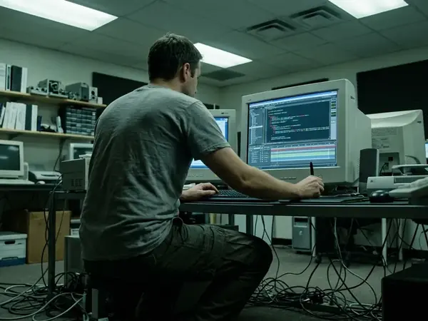
The architecture of a digital opening sequence rests on four concrete decisions: the duration of the introduction, the placement of the skip button, the behavior of the audio track, and the transition into the usable site. The "Skip Intro" button established a strict design contract. The spectacle asked for the visitor's attention, while the control promised a way to reclaim their time. During the peak of Flash-era studio sites and campaign microsites, this exchange defined the rhythm of digital entry. Not every opening relied on the same loading or navigation pattern. A standard timeline allocation dedicated 120 to 240 frames at 24fps for the initial visual hook before the primary navigation array initialized. This created a critical three- to five-second window where the user decided whether to engage with the spectacle or seek the bypass control. The tension between narrative ambition and user agency played out entirely within these opening seconds. Designers had to balance the desire to showcase technical prowess with the fundamental requirement of usability. The initial visual hook served as a filter, separating those willing to experience the brand narrative from those demanding immediate utility. The presence of the bypass control acknowledged that attention is a finite resource. It provided an escape hatch for the impatient. The execution of this exchange required precise choreography. The timing of the button's appearance, its visual weight, and its responsiveness all contributed to the overall perception of the site's performance. A poorly implemented skip function could frustrate a user before they even reached the main content. A smooth bypass reinforced a sense of control and respect for the visitor's time.
Masking the Payload Versus Extending the Delay
Preloader sequences could hold the user for four to six seconds while fetching an initial 300KB to 500KB asset payload. A secondary loading phase often buffered an additional 1.2MB of vector animation data in the background. These technical constraints forced a choice between providing raw loading feedback and crafting a deliberately paced animation. An intro could mask a necessary wait. It could just as easily extend one. A first-time visitor requires orientation and context, often welcoming a brief narrative setup that establishes the brand's visual language. A returning visitor needs immediate access to the navigation. Assessing pacing in an archived experience requires looking past the visual polish to identify exactly when a useful control appears. We must determine when content actually becomes available and whether the animation continues to delay entry long after the assets have loaded. The distinction between a functional preloader and an indulgent cinematic sequence often came down to a few seconds of forced attention. When the animation finished before the assets loaded, the sequence felt justified. When the assets loaded but the animation forced the user to wait for a dramatic conclusion, the sequence became an obstacle. The most effective designs synchronized the narrative arc with the technical reality of the network connection. They provided just enough visual interest to occupy the mind while the browser did the heavy lifting.
Synchronizing Narrative and Network
Design Check: Asset AvailabilityThe critical metric is the delta between asset readiness and user control, rather than the length of the animation itself. If the 1.2MB vector payload finishes buffering at second three, any animation extending past second four without offering a bypass artificially inflates the wait time.
The Mechanics of the Bypass Control
A Flash-era skip-button taxonomy distinguishes visible-immediate placement from delayed-reveal choreography. Positioning the bypass control in the bottom-right quadrant typically required a 400-millisecond fade-in after the initial stage draw. Designers sometimes expanded the hit area by 10 to 15 pixels beyond the visible text boundaries to accommodate rapid cursor movements. A visible control that remains findable as the animation changes offers genuine agency. A delayed button that leads to yet another wait offers only the illusion of control. Skipping the presentation must be separated from reaching a usable destination. Evaluating historical skip-button efficacy requires access to the original SWF files or unedited screen captures, as relying solely on stitched video documentation obscures whether the button was actually interactive during the initial load sequence. The physical act of moving the cursor to the corner of the screen became a learned behavior for an entire generation of web users. The design of the button itself—often a minimalist typographic element—contrasted sharply with the rich media it was designed to interrupt. This visual distinction signaled its functional nature. It stood apart from the narrative, existing purely as a utility. The decision to delay its appearance was often a calculated risk, forcing the user to absorb at least a fraction of the opening spectacle before granting them an exit.
Defining the Hit Area
Interaction Target SizingExpanding the hit area by 10 to 15 pixels compensated for the lack of tactile feedback in early digital interfaces. Users moving quickly to bypass an intro often overshot the visible text. A generous invisible boundary ensured the click registered even if the cursor was slightly misaligned.
Audio Architecture and the Interruption Problem
Sound dictated the terms of entry. Openings that relied on audio for dramatic timing demanded a different level of commitment than sequences that remained legible in silence. The architectural boundary between timeline-bound audio loops and ActionScript-managed sound objects during bypass events defined the user experience. Tying the background audio loop directly to the main timeline could leave overlapping tracks when users clicked 'Skip'. Separating the sound object into a distinct ActionScript class allowed it to be explicitly muted upon bypass. A roughly 1.5-second audio fade-out could trigger simultaneously with the visual transition. Managing a 128kbps MP3 soundtrack prevented abrupt clipping when the user interrupted the sequence. Skipping had to resolve the intro’s audio cleanly rather than leaving it attached to the destination. The auditory experience required as much structural planning as the visual timeline. An abrupt cut in the music signaled a broken experience, jarring the user and breaking immersion. A smooth fade-out, synchronized with the visual transition to the main menu, maintained the site's premium feel even when the user rejected the primary narrative path. The technical separation of audio and visual elements allowed for this graceful degradation. It ensured that the act of skipping felt like a designed interaction rather than a system error.
Executing the Transition to Interactive State
The transition determines whether the skip promise is honored. A direct handoff into navigation respects the user's choice. A sequence that introduces another reveal, a menu animation, or an additional wait violates the contract. Visitors need a clear destination. A handoff sequence could use 15 to 25 frames to animate the navigation menu into its active state. The goal was ensuring the destination interface became fully interactive within 800 milliseconds of the skip command being registered. Consider a hypothetical studio-site sequence for Exopolis, a digital creative agency. Watching the opener builds brand narrative, while choosing Skip Intro demands immediate utility. Both paths must resolve to the same functional state. Reviewing the historical records preserved by the acquiring agency, McGarrah Jessee, reveals how these transition states were documented. A SunnyD campaign site required a different pacing strategy than a boutique portfolio. The interaction models pioneered here eventually influenced later spatial interfaces, including the gesture-based bypass controls seen in Xbox Kinect Fun Labs. The choreography of the handoff required meticulous attention to spatial continuity. Elements from the intro sequence often morphed or scaled to become the structural foundation of the main navigation. This visual continuity helped orient the user, bridging the gap between the cinematic opening and the functional interface. When executed correctly, the transition felt inevitable, regardless of whether the user watched the full sequence or triggered the bypass.
Validating the Bypass Route in Modern Prototypes
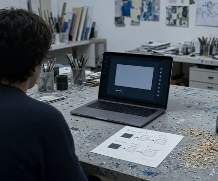
For a modern prototype, target a maximum 200-millisecond delay between the skip interaction and the rendering of the primary DOM elements, with a 50-millisecond threshold for audio muting response. Turn this historical comparison into a practical design check. Make the destination available immediately. Expose the skip control early. Keep sound controllable from the first frame. Test both routes into the same usable state. Reviewing a prototype requires evaluating the experience on first and repeat visits. You must account for what happens if animation or media has not finished loading. The principles established during the era of timeline-based animation remain entirely applicable to modern component-driven architectures. The user's time remains the most valuable metric. The desire to present a polished brand narrative must always be balanced against the friction it introduces. A beautiful opening sequence that frustrates the user fails in its primary objective. Design the skip path first. Add an opening sequence only if it improves the experience without weakening that primary path.