Table of Contents
- What a Format Shift Does to the Message
- The Picture Edge and the Arrangement Inside It
- Pair the Frames Before Naming the Change
- Follow the Title, Not Only Its Edges
- Clearance Through the Whole Move
- A Record That Separates Seeing from Redrawing
- Rehearse the Title Where the Crop Cuts
What a Format Shift Does to the Message
Adapting a broadcast graphic between 4:3 and 16:9 can cut a title in half, soften a visual hierarchy, or split moving elements that originally traveled as one unit. The file may still play. The message may not survive the new window.
That stake belongs to mid-2000s commercial motion, when widescreen and standard-definition masters left the same job on the same day. Designers studying those reels, or rebuilding a campaign sequence for a later frame, meet both versions at once. The archive is a production record of studio delivery, not a single canonical picture.
Cropping changes the visible window. Recomposition changes placement, scale, or the relationships among elements inside that window. A tighter window can mimic a redesign. A true redesign can hide inside a frame that still looks complete.
Commercial deliverables from the 2004 to 2008 broadcast transition frequently required simultaneous 4:3 standard-definition and 16:9 widescreen master tapes. Cataloging those reels showed deliberate layout changes sitting between the two files. Treating one tape as a mechanical extract of the other buried the design decision. Element-level comparison became the protocol: same spot, same visual event, separate questions about type, logo, and motion.
Standard NTSC D1 compositions were built at 720 by 486 pixels. Widescreen square-pixel equivalents sat at 854 by 480 or 1280 by 720. Those figures name the containers the studio handed off. They do not yet say whether the title was redrawn.
The Picture Edge and the Arrangement Inside It
4:3 is a squarer field. 16:9 is a wider one. Neither shape is a later, smarter stage of the other. Each asks type and picture to share a different proportion, and each was a real delivery target in that transition.
Five spatial reads keep the comparison honest: frame-relative position, element bounding size, edge clearance, internal alignment, and visual hierarchy. Taken together, they show whether a mark moved, shrank, lost air, lost its partner, or lost its rank.
Center Crop, Bars, and a True Rebuild
Center cropping keeps the middle and discards the sides, or the top and bottom, depending on which way the aspect is traveling. Letterboxing adds horizontal bars so a wider picture can sit inside a taller frame. Pillarboxing adds vertical bars so a narrower picture can sit inside a wider frame. Uniform scaling enlarges or reduces the whole plate by one ratio. Element-level recomposition moves, resizes, or restacks individual layers so the new frame still reads as a designed arrangement.
The visible consequences differ. A center crop shears peripheral picture and can shove a logo against a title that used to have air between them. Bars leave the original arrangement intact and announce themselves as borders. Uniform scaling keeps internal gaps proportional. Recomposition breaks that proportion: a headline rebreaks, a logo shifts off the shared scale, a lower third finds a new anchor.
Curators measuring digitized tape captures first treated the outer pixel dimensions of the QuickTime container as the reference frame. That approach was dropped once non-black encoder padding and vertical blanking intervals skewed relative element coordinates. Analog tape digitizations often include 8 to 16 pixels of horizontal blanking or black pillarbars baked into a 720-pixel-wide container. The lit image is smaller than the file.
Measure the Lit Frame
Coordinate measurements taken from the outer 720 by 486 video file, rather than the illuminated active image, will falsely classify letterboxed or pillarboxed transfers as recomposed layouts. Read positions against the active picture, then decide what changed.
Playback borders and presentation borders belong in the same caution. A monitor matte, a player window, or encoder black is not part of the composition the motion designer placed. Measuring the whole video container misidentifies an adaptation because the extra pixels were never a design field.
Pair the Frames Before Naming the Change
A paired comparison starts as a record, not a verdict. Write down the spot title, the version identifier, the archive location, the aspect ratio, and the matching visual event before any overlay. Those five notes stop two similar end cards from being treated as the same moment.
What the Head of the File Will Not Tell You
Broadcast leader and slate variations routinely offset identical commercial masters by 30 to 90 frames at the head of the file. A shared start timecode is therefore a weak twin. 3:2 pulldown removal, converting 29.97 frames per second interlaced video to 23.976 frames per second progressive, shifts frame numbers across a 30-second spot even when the pictures match. The clocks disagree. The motion does not.
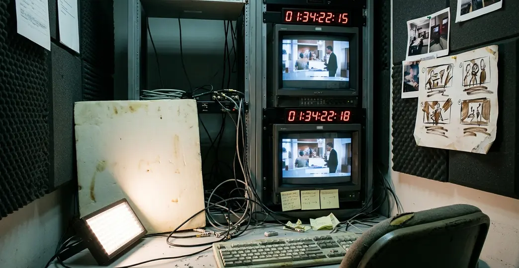
Lock the pair to a deterministic event: the exact frame a hard cut occurs, or the frame a kinetic title reaches zero velocity. That event travels with the design. Slate length, leader standard, and pulldown cadence do not.
Lock the Event
Match versions by an identifiable animation event. Identical playback timestamps are an assumption the head of a broadcast file is built to break.
Once the frames match, measure element bounding boxes and anchor positions relative to the active picture. Keep those measurements in editorial notes. The notes are the finding. A published percentage invented after the fact is not.
On heavily compressed web proxies, macroblocking obscures fine typographic edges and semi-transparent drop shadows, so bounding-box reads for this kind of title comparison belong on the cleaner master, not the proxy.
Follow the Title, Not Only Its Edges
A title can clear both frames and still be a different piece of writing. Width, line breaks, alignment, and spacing are the places a narrower or wider composition shows its hand.
In a tighter 4:3 window, a two-line headline may wrap to three, lose tracking, or slide from a left anchor toward center so it can share the remaining field with a logo. In a wider 16:9 window, the same words may open into one line, gain letterspacing, or drift toward a side that the standard-definition master never offered. Spacing between the last line and a brand mark is part of that story. If the gap changes while the words stay intact, the hierarchy has already moved.
Scaling Together or Redesigning Apart
Paired commercial end cards separate mechanical scaling from typographic redesign by a simple ratio check. If tracking, line breaks, and the baseline gap between a headline and an adjacent brand mark scale at the same ratio as the background plate, the type rode along with the picture. If those measures move on their own, someone redrew the card.
A three-step inspection keeps that check repeatable. Verify line-break word wrapping. Measure cap-height relative to active picture height. Check baseline or center alignment against neighboring graphic anchors. The first step catches a rewrite. The second catches a rescale that is not the plate's rescale. The third catches a title that still fits and no longer belongs to its logo.
Lower-third supers typically occupy the bottom fifth of the active vertical picture height across a 60-to-120-frame reading hold. That band is a working habit of broadcast supers, not a law. It does give a reference: if a super jumps out of that band on one master and stays inside it on the other, the change is compositional, even when every letter remains visible.
Visibility and rank are different jobs. A title can sit fully inside the new window and still lose hierarchy once its relationship to a logo, a subject, or a background plate changes. The words survived. The arrangement that made them the headline did not.
Clearance Through the Whole Move
Title-safe positioning is a working placement constraint inside the picture, a zone the type is meant to occupy while the frame edge sits farther out. It is a production habit for keeping words readable on unpredictable displays. It is not another name for the picture boundary, and it is not the crop line of a later aspect ratio.
A resting position is only one phase. Kinetic titles also have an entrance trajectory, an overshoot peak, a reading hold, and an exit path. Clearance has to be inspected through all four. Restoration work on kinetic sequences reads the whole life of the title against the target crop, including the 15-to-20-frame entrance and exit transitions, because a settled end card can look legal while an earlier phase already struck the edge.
Spring and ease-out interpolations frequently push animated text 10 to 35 pixels past its final resting coordinate during a 4-to-8-frame overshoot phase. That excursion is part of the design on the original master. On a tighter crop it becomes a collision. The hold can sit comfortably inside the new window while the overshoot has already crossed the cut and come back.
A centered end frame is a poor witness. It conceals an earlier edge collision, and it conceals a broken relationship between elements that only misalign while they are still moving. Scrub the entrance, the peak, the hold, and the exit. Then decide whether the crop preserved the move.
A Record That Separates Seeing from Redrawing
Frame comparisons turn into adaptation notes only when observation and instruction live in different columns. Editorial sheets for this work split locked observational fields, which describe the source pair, from directive fields, which describe a modern re-version. Mix those columns and a reference study quietly becomes a redesign.
A compact log carries five fields: matched visual event, target graphic element, observed spatial difference, mechanical crop hypothesis test, and recommended adaptation action. The first four stay with what the frames show. The fifth is allowed to propose a change, and only there.
Three verification layers sit under those fields. Preserve raw visibility, so wording is not sliced. Preserve relational hierarchy, so a title still outranks or partners its logo as it did. Preserve motion trajectories, so an entrance that was designed to overshoot is not flattened into a static fit. A crop can pass the first layer and fail the other two.
Split the Columns
Write the observed difference before any adaptation action. If the crop hypothesis already explains the picture, say so. If it does not, the action belongs to elements, not to a tighter window.
A Hypothetical End Card, Not a Case File
The arrangement below is a drill, not a documented historical spot. Imagine a 16:9 end card: a two-line product title on the left, a circular logo on the right, a clear gap between them, both marks inside the right-hand two thirds, the title reaching zero velocity on the hold.
- Matched visual event: the frame the headline reaches zero velocity.
- Target graphic element: headline and logo as a pair.
- Observed spatial difference: a center extraction toward 4:3 keeps every letter and the whole logo inside the new window, and it collapses the gap so the title nearly touches the mark.
- Mechanical crop hypothesis test: the new window matches a center crop; line breaks and cap-height ratio match the wide master. The crop explains the tighter gap. It does not explain a redesign, because the type itself did not change.
- Recommended adaptation action: translate the logo or retack the headline so the original gap returns. Do not log the center cut as a finished layout.
If the same drill showed a new line break or a cap-height that no longer matched the plate, the hypothesis test would flip. The crop would no longer be a sufficient account. The observational column would record a typographic intervention. The directive column would then decide whether a new version should follow the wide master, the narrow master, or a fresh arrangement stated as new.
Rehearse the Title Where the Crop Cuts
Before a legacy widescreen spot is committed to a narrower aspect, or a 4:3 master is opened into 16:9, the rehearsal is concrete. Take a frame that holds the principal title and the logo. Identify the active picture, ignoring encoder black, pillarbars, and player mattes. Preview the intended alternate framing with a non-destructive guide mask over the full master sequence, then scrub the title's entire life cycle.
A five-step check keeps that rehearsal from turning into a glance at the end card. Match the animation event. Isolate the active picture boundary. Measure inter-element relationships. Scrub the title motion arc. Log the spatial modification. The third step asks whether the title still aligns with the logo. The fourth asks whether that alignment survives the move. The fifth refuses to let a passing still stand in for the sequence.
Check the title's complete wording, its alignment with the logo, and its clearance during the surrounding motion. If the framing breaks those relationships, specify an element-level adjustment: a horizontal translation, a rebreak, a revised gap. A tighter crop is a test, not a finished adaptation.
The hold is the easy frame to trust, and it is the frame that misleads. A title whose resting hold sits comfortably inside the 4:3 crop boundary still fails the adaptation check when its 6-frame elastic entrance overshoot crosses the cut line before settling.